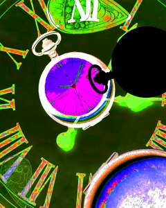
 Final: This is my final draft I really like the bright colors and the way the pink clock face is the focus point of the image. I achieved these colors by using the invert, hue/saturation, vibrance, and brightness/contrast adjustments.
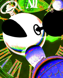
 Draft: For this draft I put some chain mail in the background to give it some texture. I adjusted the levels and the color balance. Finally I inverted the colors.
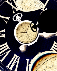
 Draft: For this draft I adjusted the invert color balance and the levels. This one has a old times feel to it which I think is likable.
 Draft: This is the original lay out for this project. I changed it because it felt too cluttered.
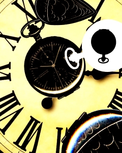
 Draft: Same as my final without the invert adjustment.
